Google is always On the yaw of improving himself, today only a new logo was was in my chromium browser, that was really cool , The company today announced that it’s making some changes to its iconic logo and overall branding. It’s also making changes to the design of its mobile search results pages.
The company says it’s making these changes because the way people interact with its products has changed. The idea is for the new logo and identity family to reflect “this reality and shows you when the Google magic is working for you, even on the tiniest screens.”

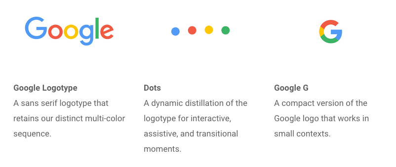
So what has changed? The old Google colors are still there, but the company has moved from a serif font to a sans-serif font for its full logo. For its icon, Google has done away with the small blue ‘g’ icon and has replaced it will a four-color “G.”
“We think we’ve taken the best of Google (simple, uncluttered, colorful, friendly), and recast it not just for the Google of today, but for the Google of the future,” the company writes in today’s announcement.
In a more in-depth post, Google explains the thinking behind the new logo’s design. The team says it wanted to distill “the essence of our brand down to its core — four colors on a clean white background — and built it back up.”
BRYBGR Color Scheme
Blue - most popular online (2)
Red - Most Catchy Color(2)
Green & Yellow - eye Catchy color, (1+1)
Analysis
6 Alphabet 4 Colors And 1 Google G
In this process, the team decided to take the old logo and combine its “approachable style” with “the mathematical purity of geometric forms with the childlike simplicity of schoolbook letter printing.”

Google says it’s also making some changes on its mobile search pages. For now, those changes look subtle, with a stronger focus on swiping through results horizontally (similar to what Google is already doing with Twitter results, for example).
The Google mobile app is also getting a refresh in line with these changes today, as well as a few updates to how it presents Google Now cards (which now shift and change size throughout the day).
It looks like the new brand identity is already making its way to Google’s campus, too:
Given the fact that Google is now part of Alphabet, it’s probably not a major surprise that the company is using this time of change to refresh its brand, too.I am pretty sure G will be the most common Alphabet of A
lets stay back and feel the good changes in the google ... or should i start calling it alphabet, i guess all big name start with A , so everybody should change their name , And use a Name that Start With A :) kidding Stay tuned :)
Anyway If You are looking forward to create a New logo for You , Logstar do it very good .
No comments:
Post a Comment